
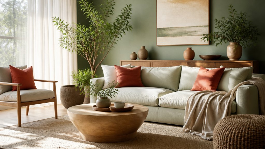
The colours you choose can change how a room feels and how well it serves your daily needs. Warm shades can make shared spaces feel inviting, while cool tones can help you unwind in a bedroom or study. But the right colour depends on more than personal taste: lighting, room function, and balance all matter. Before you pick a paint swatch, consider how each choice could shape the space—and what to avoid.
Key Takeaways
- Choose colours based on how you want each room to feel and function, such as calm bedrooms or energising workspaces.
- Use warm hues to make large rooms feel welcoming, and cool hues to make smaller spaces feel more open.
- Balance vivid colours with neutral tones, repeating bold shades in accents for a cohesive look.
- Consider natural and artificial lighting, since it changes how colours appear and affect a room’s mood.
- Test large paint samples at different times of day and alongside your furnishings before choosing a final colour.
Understand How Colour Affects a Room
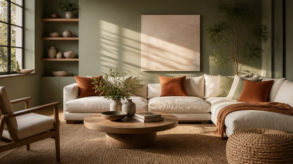
Colour does more than decorate a room—it shapes how you perceive its size, light, and mood. When you understand these effects, you can make more confident design decisions.
Pale colours reflect light and can make a space feel more open, while darker shades absorb light and create a sense of depth. A colour’s intensity matters, too: vivid hues draw attention, whereas muted tones tend to feel quieter.
Colour symbolism also influences how you interpret a space, but meaning varies across cultures and personal experiences. Red might suggest energy to you; blue may feel calming.
Consider these associations alongside the room’s natural light, proportions, and finishes. The psychological effects aren’t universal, so pay attention to your own responses.
Test paint samples in changing daylight before committing, and notice how each shade affects your perception and comfort.
Choose Colours for Each Room
As you choose colours for each room, start with how you want the space to feel and function. In a kitchen, select shades that make everyday tasks feel inviting and support a clean, practical look.
For a bedroom, choose colours that help you unwind and suit your preferred décor. In a home office, consider hues that keep the space focused and reflect your work style.
Use Color theory to build a coordinated palette: repeat a main colour, then add complementary accents through furnishings or artwork.
Before committing, test paint samples in the room and view them alongside flooring, fabrics, and furniture.
Consider cultural associations, too, since colours can carry different meanings for you and your household.
Choose a palette that feels personal, works with each room’s purpose, and connects your home as a whole.
Set the Mood With Warm or Cool Colours
To shape how a room feels, choose between warm colours, such as red, orange, and yellow, and cool colours, such as blue, green, and violet.
Warm shades can make a living area feel welcoming and lively, while cool tones often create a calmer, more restful atmosphere. Consider the room’s purpose and how you want to feel there before you settle on a palette.
Color temperature also affects how spacious a room seems. Warm hues can make a large space feel more intimate; cool hues can help a compact room feel open and airy.
Think about natural light, too: a north-facing room may benefit from warmer shades, while a sunlit room can handle cooler ones.
Notice each colour’s emotional impact in your space, and choose tones that support the mood you want to create.
Balance Bold Colours With Neutrals
Bold colours can bring energy and personality to a room, but pairing them with neutrals keeps the look balanced. Use white, beige, grey, or natural wood to give vivid shades space to stand out without overwhelming your living area.
For example, anchor a cobalt-blue sofa with pale walls and a simple rug, or pair terracotta cushions with cream upholstery.
Choose one dominant bold colour, then repeat it in smaller details to create a considered look. Complementary colour schemes can add contrast, but let neutral surfaces soften the effect and keep the room comfortable.
Try colour accent techniques such as painting a single wall, adding a colourful lampshade, or displaying artwork against a calm backdrop. You’ll create a space that feels expressive yet cohesive, with colour supporting the mood you want.
Test Paint Colours in Your Home’s Light
Because light changes throughout the day, a paint colour can look different on your walls than it does on a sample card. Test your shortlist before committing, so you can see how each shade supports the room’s mood and function.
Paint large sample swatches on several walls, or use movable boards you can reposition. Check them in morning, afternoon, and evening light, with your usual lamps switched on. These lighting effects can make warm tones feel richer or cool tones appear stark.
Notice how the colour works with flooring, furniture, and fabrics; strong colour contrast may energise a space, while softer pairings can feel restful.
Live with the samples for a few days. View them from different angles and beside existing finishes. Then choose the shade that feels right throughout your daily routine.
Leave a Reply