
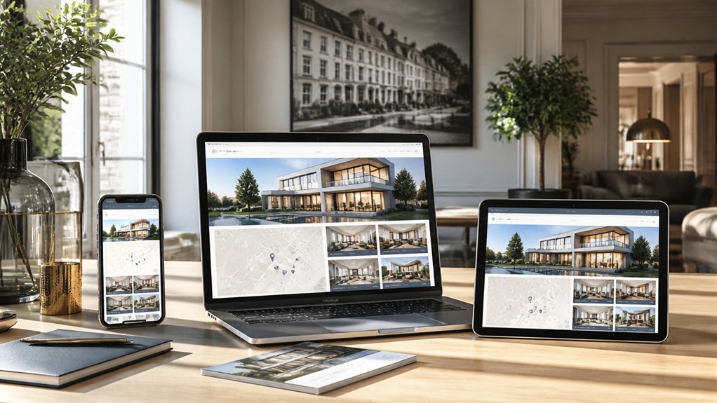
Your property listings may look impressive on a desktop, yet frustrate clients on a phone. A responsive estate agent website gives you a consistent, easy-to-use experience across every screen, helping visitors find homes and contact your team without friction. With flexible layouts, clear navigation and touch-friendly controls, you can turn mobile browsing into genuine enquiries—but only if every step works as smoothly as it looks.
Key Takeaways
- Use a responsive framework so navigation, layouts, and property images adapt smoothly to phones, tablets, and desktops.
- Keep branding consistent with clear typography, uniform colours, and flexible content blocks that are easy to update.
- Make property listings mobile-friendly with fast-loading photos, readable details, touch-friendly controls, and prominent enquiry buttons.
- Provide simple property search filters for location, price, type, and bedrooms, with visible criteria and helpful no-results messages.
- Test across screen sizes, browsers, and operating systems, then refine layouts and actions using feedback from unfamiliar users.
Build a Responsive Estate Agent Website

Your estate agent website should work just as smoothly on a phone as it does on a desktop. Build it with a responsive framework that adapts layouts, images, and navigation to different screen sizes. This helps every visitor explore your services without struggling with awkward menus or unreadable text.
Start with a clear structure: make it easy to find your agency’s expertise, contact details, and key services. Use consistent colours, fonts, and imagery to reinforce branding consistency across devices. Choose flexible content blocks so you can update pages without disrupting the design.
Consider how features such as virtual tours fit into the wider experience. Test the site on common browsers and screen sizes, then refine any issues you find. A polished, adaptable website builds trust and gives clients a confident first impression of your agency.
Make Property Listings Work on Mobile
Make property listings easy to browse on a phone by prioritising clear photos, concise details and touch-friendly controls. Give each home a well-structured page, so buyers can quickly understand its key features, price and location without pinching or zooming.
Use high resolution images that load efficiently and let visitors tap to view them clearly. Add virtual tours that work smoothly on mobile, giving prospective buyers a realistic sense of each room before they book a viewing.
Keep essential details readable, with comfortable spacing and buttons large enough to tap accurately. Make enquiry and viewing options visible on every listing, so interested buyers can contact you at the moment they’re ready.
Test pages on different screen sizes to catch awkward layouts, slow-loading media and controls that frustrate users. A polished mobile listing builds trust and encourages meaningful enquiries.
Simplify Mobile Property Search and Navigation
Once buyers can browse individual listings comfortably, help them find the right homes without friction. Keep your property search prominent, with a clear field and an easy-to-tap button. Let visitors search by location, price, property type, and bedrooms, then make filters simple to apply, review, and clear.
Show active criteria so buyers know why results appear, and provide a useful message when a search returns no matches.
Make navigation ease a priority with concise labels, a visible menu, and a clear route back to results. Keep key actions, such as saving a home or contacting your team, easy to find without crowding the screen.
When buyers can refine results and move between pages effortlessly, they’re more likely to stay engaged and enquire about properties that suit their needs.
Test Your Estate Agent Website on Every Screen
Test your estate agent website on phones, tablets, laptops, and desktop screens to catch layout issues before visitors do. Check key pages at common screen sizes, then resize your browser to reveal awkward shifts between breakpoints. Make sure property photos stay clear, text remains readable, and search filters, menus, and listing cards fit without crowding or clipping.
Don’t rely on a single device or browser. Test across operating systems and browsers your clients use, and ask someone unfamiliar with the site to complete typical browsing tasks. Their feedback can expose confusing layouts you’ve grown used to.
Fix inconsistent spacing, broken controls, and slow-loading images before launch. Careful testing supports visual consistency and strengthens User engagement by making every page feel dependable. Recheck after updates, so new content or features don’t undermine the experience across screens.
Turn Mobile Property Browsing Into Enquiries
When mobile visitors find a property they love, make it easy to take the next step. Place clear enquiry and viewing buttons beside key details, so buyers don’t have to hunt for contact options. Keep forms short, use mobile-friendly fields, and let visitors call or message you with one tap.
Help people feel confident before they enquire. Add high-quality photos, accurate descriptions, and Virtual tours that load smoothly on smaller screens. Show Client testimonials near property listings or contact forms to reinforce your agency’s credibility at the decision point.
Make every action simple and reassuring: explain when your team will respond, confirm submissions instantly, and avoid intrusive pop-ups. When you remove friction and build trust, you’ll turn more mobile property browsing into meaningful enquiries—and help serious buyers connect with you sooner.
Leave a Reply